The Peterborough Psalter
With its elegant figures, delicately incised gold patterns and exquisitely modelled draperies and faces, this Psalter is an outstanding example of English illumination of the early 13th century.
Specific features of the liturgical texts and the depiction of an abbot in one of the historiated initials show that the manuscript was made for the Benedictine Abbey of Peterborough in the 1220s. Highly burnished gold grounds and crisp black outlines set off the artfully applied colours, ranging from locally sourced organic yellows to imported ultramarine.
Learn more about the manuscript by exploring the sections below or selecting folios on the right. Discover further details by choosing any of the folios with the hotspot symbol ![]() .
.
The main artist, though anonymous like many of his contemporaries, was one of the most accomplished English illuminators of the early 13th century. He painted the 2 full-page images, the 4 historiated initials and probably the 3 large foliate initials in gold and richly saturated colours, which mark the main textual divisions. Skilled assistants would have executed the remaining ornamental initials, which are painted in a different style and in a more modest range of hues.
The manuscript was commissioned after 1220 by an abbot of Peterborough who is depicted in the initial for Psalm 101 (fol. 139v). Richard, VII Viscount Fitzwilliam of Merrion (1745-1816), acquired the manuscript in 1808 and bequeathed it to the Fitzwilliam Museum in 1816.
The manuscript contains the standard texts found in early Gothic Psalters. The 150 Psalms of the Old Testament are prefaced by a Calendar, which begins and ends with related tables, and a circular diagram (rota) used to calculate the date of Easter. The Calendar has burnished gold initials, but contains no figural decoration. After the Psalms come the biblical Canticles, the Litany and the Office of the Dead. A full-page miniature of the Crucifixion precedes the Psalter, which is divided into 10 sections for daily readings. Psalm 1 opens with a full-page initial, and 4 other Psalms marking the major text divisions have large, historiated initials. Three other ‘division’ Psalms are introduced by large, fully illuminated initials with foliate ornament. Due to the loss of folios, the large initials that would have marked Psalms 68 and 97 are missing. Red and blue penwork initials filled with foliate ornament in multicoloured washes with occasional touches of gold mark some remaining major text divisions in the Psalms, Canticles and Office of the Dead. Other major text divisions are signalled by red and blue penwork initials filled with scrolling patterns in the contrasting colour. Small red and blue penwork initials mark minor text divisions throughout the manuscript.
The colour scheme and palette are fairly homogeneous across the manuscript. Carbon black, lead white, red lead, ultramarine blue and verdigris were used on every page. An organic yellow was applied over either lead white or chalk in several different folios. Red organic dyes, likely extracted from insects, provided pink hues when mixed with gypsum, chalk and lead white. Gold leaf was used extensively, while silver was identified only on fol. 159r, where it has degraded. Some differences were observed between the two full-page illuminations (fols. 12r, 12v) and the rest of the decoration.

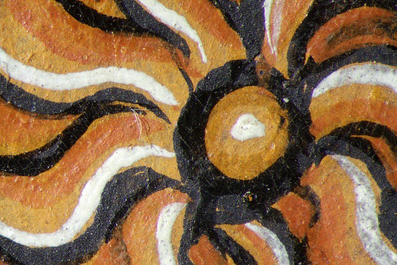
Crucifixion
The style of the Crucifixion supports a date for the manuscript in the early 1220s. Christ's slender torso, which curves gracefully to one side, breaking the symmetry of the composition, reflects new artistic ideas surfacing at that time. The single nail that pins Christ's overlapping feet is another new motif that gradually replaced the custom of showing two nails, one for each foot.
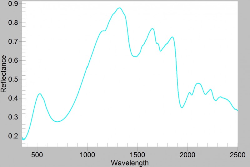
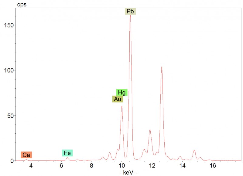
The pigment used for the green cross is verdigris, a copper-based pigment that appears dark in the infrared image. Green crosses, some plain and others formed of rough timber beams or branches, appear in Crucifixion scenes from the 11th century onwards. Artists used the colour to link the cross with the Tree of Life in the Garden of Eden as described in Genesis. Eating the fruit of the Tree of Life guaranteed eternal life, a promise matched by Christ's atoning death and resurrection, which, according to Christian theology, offered redemption and immortality to humanity.
The Virgin's pink mantle is painted with an insect-based organic dye, highlighted with lead white and decorated with red lead and lead white dots. The inner part of the folds were coloured with an organic yellow glaze over lead white. The draperies are defined with thick carbon black outlines (hotspot 2). The tunic is modelled with different shades of blue obtained by mixing ultramarine and lead white in different proportions, which are juxtaposed and separated by black outlines.
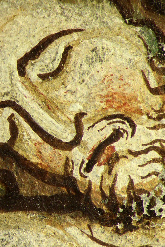
Flesh tones are modelled with a light pink mixture of lead white and an earth pigment. Vermilion and lead white provide highlights and a light brown earth pigment is used in the shadows. Facial features, hair and beard are defined with brushstrokes of brown ink (hotspot 3).
Related content: The Peterborough Psalter
Related content: Lab
- Overview of Artists' Materials: Cinnabar and Vermilion
- Overview of Artists' Materials: Organic red colourants
- Overview of Artists' Materials: Organic yellow colourants
- Overview of Artists' Materials: Verdigris
- Analytical Methods: Near-infrared imaging
- Analytical Methods: UV-vis-NIR reflectance spectroscopy
- Analytical Methods: X-ray fluorescence spectroscopy